tunnelling through structure

As Web critic Stuart Moulthrop is fond of pointing out, one of the rarest applications of Hypertext Markup Language is hypertext. For years, real hypertext on the Web has been rare; instead, we have little hierarchical clusters with a few internal links, accompanied by a raft of links to friends, advertisers, clients, or colleagues. This kind of simple structure works well for very small sites, and also for very large sites -- directories, databases, and compendia, where very simple structures are necessary for managing cartloads of data.
In recent months [this essay was published in 1996 -- ed], though, the Web community has begun to rediscover the utility of thoughtful hypertext structure. A first step in this direction is the rediscovery of what George Landow termed, in 1987, "the rhetoric of arrival"; the first duty of a web site is to explain itself and its purpose.
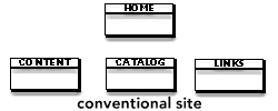
Traditionally, the "home page" of a site has tried to do it all. It announced the site's name, its purpose, its image. It described the site's internal structure. It displayed the site's technical prowess. In a real sense, the cover page was the site. Everyone was expected to see the cover page first; people revisiting the site would then click on "what's new".
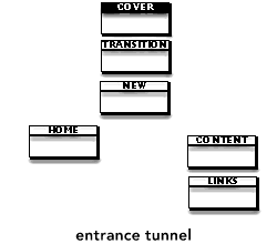
 Lately, some stylish sites have adopted a special entrance, sometimes called a "tunnel", that introduces the site to new visitors. The tunnel is the site's manifesto: it positions the site. The tunnel is also the site's cover; it sells the site to readers who skim by. Often, tunnels are transient, using client-pull to create a brief self-running introduction.
Tunnels do not have to describe the site's structure or provide links to new content, because tunnels chiefly serve first-time callers and occasional visitors. Frequent readers will bookmark the core page -- the end of the tunnel -- for direct access to new information.
The site maps in this note were sketched in Storyspace. Screen shots were then opened in Fractal Design Painter, trimmed, shadowed, and exported to GIF.
The Storyspace map view can make a handy tool for sketching out web site structures, especially when you'd like to discuss structure decisions apart from implementation details.
The tunnel/core page split differentiates two roles of the traditional home page:
- Introducing the site to new visitors
- Guiding repeat visitors
By putting ads in the tunnel, the tunnel can also separate advertising from editorial matter without relegating the ads to a seldom-viewed sponsors page.
Of course, a bad tunnel is a disaster; people who are bored in the tunnel will never see the core page at all.
