
|
|
|

|
|
|
|
type |
The interplay between what we see and what we are led to see is often rich and complicated. Looking at type makes our attention oscillate: we see shapes on the page and at the same time we envision the ideas these shapes represent. This oscillation is especially prominent, at present, for hypertext (and for Web design) because hypertext is new and unusual. Few of us have seen a great deal of hypertext, so the surface of the hypertext is not yet as familiar as the appearance of our daily newspaper or favorite magazine. On paper, designers must make an effort to call attention to the page as artifact; for hypertext, the screen still calls attention to itself. This will change in time, but that time is still to come.
|
Print is manufactured at a factory, but hypertext pages are created on the reader's machine whenever the reader turns to see them. The limitations of different machines restrict the typographic choices available to hypertext writers. Many readers have small screens, so we must usually design small pages. Complicated formatting requires fast processors, so reaching a broad audience may confine us to simple layouts. Different people own different fonts; hypertext designers must use standard fonts or find ways to include fonts with the hypertext. On the Web, designers have had little control over fonts and typography; the development of cascading style sheets, fonts designed for the Web, and TrueDoc embedded fonts, however, now give Web designers extensive control over the typography of Web pages when viewed with the latest browsers while ensuring that the pages continue to be legible with older software.
|
Stop Stealing Sheep (& find out how type works) by Erik Spiekermann and E. M. Ginger is a superb, readable, and amusing guide to typography -- to the art of designing the page (or the screen) for legibility and utility. Rich in examples (and wit), Stop Stealing Sheep explains the rules of typography, their history and purpose. Different fonts play different roles, and each role is explained here: brush fonts for spontaneity and casual signage, block serif fonts for low-resolution media like faxes, sans serif fonts for clean lines, traditional serifs for legibility. The authors are refreshingly candid; where many design texts justify their rules with polemical manifestos, Spiekermann and Ginger simply note that these rules have become customary and that, because familiar things are easier to perceive at a glance, the rules make pages more transparent and more legible. The book's design makes an intriguing bow toward hypertextuality, as each page features a main text for general readers accompanied by a sidebar for experienced designers. Spiekermann and Ginger have a flair for explaining historical trends without pedantry and for explaining design fashion with neither condescension nor mindless trendiness.
Fashionable faces
One thing leather jackets have on trendy typefaces is that the jackets get better as they get older, which is more than can be said about some of the faces we loved in the 1970's but would be too embarrassed to ask for now. Like all fashions, however, they keep coming back. Don't throw away your old fonts -- keep them for your kids.
|
Stop Stealing Sheep explains the rules, and then Rob Carter's Experimental Typography systematically breaks them. Carter presents dozens of experimental posters (a form easily adapted to screens) that violate the rules in unexpected, and exemplary ways. The studies are carefully indexed and categorized: example 35, by Kelly Perkins Ramma, for instance, illustrates:
 |
At times, this can seem like an immense traffic-court of design, awash in legal citations, but the overall effect is often fascinating. Breaking one rule, Carter suggests, may make your design seem inept; breaking many at once can make the design vivid.
|
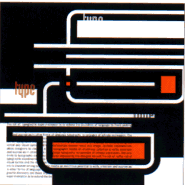
Digital Type is a compendium of slick new designs, intended primarily for print designers and advertising agencies but useful as a source of inspiration for adventurous hypertext writers. Where Experimental Typography is strongly influenced by Swiss graphic design, the idiom of Digital Type is all-American. Experimental Typography is at its best when exploring theory and composition, but Digital Type is most interesting for showing ways that theory can be applied to artifacts.
A project by James Stoecker and Margo Johnson, from Digital Type |
Magazine covers, toy boxes, post cards, invitations: adventurous design is applied everywhere. This is interesting, of course, for writers of artifactual hypertext -- hypertext narratives presented as found objects, and who often need to make text and object coexist on the screen. In Uncle Buddy's Phantom Funhouse, for example, John McDaid presents the reader with the contents of the hard disk of the late Arthur Newkirk, accompanied by a mysterious letter from a law firm explaining that he appointed us his literary executor. The reader find notebooks, sketchpads, email, tarot cards, and album covers; naturally, each has a different design. Malloy and Marshall's Forward Anywhere presents us with the correspondence of two women, an artist and a scientist; each woman writes on a different kind of paper.
Web designers, too, may find useful ideas in Digital Type, for the Web page is itself a new and challenging artifact whose boundaries (like the scroll bar and window edge) are unforgiving yet malleable.
FREE! Subscribe to the Eastgate-List, our moderated electronic mail list for hypertext news and announcements.
![]()

Eastgate
Fiction Nonfiction
Poetry Hypertext
Storyspace Tinderbox
HypertextNow Order